My School is more of a socially-minded school than others. For example, time is allotted for “community conversations,” where students lead conversations on current issues in culture, society, or politics. There are also three service days during the year, where a staff member chaperones a group of students off-campus to volunteer at food banks, fix bikes, clean up a community green space, and other options to give time to the community. The mission of our school is to help students become, “intellectually courageous and socially responsible.”
To help foster this social responsibility in students, there is a Social Justice Day, where for one day in March, students explore themed track like race, gender, religion, homelessness, water quality, orca whale populations in Puget Sound. When I saw Social Justice Day on the calendar, I volunteered to offer a Math and Social Justice track, not sure what I wanted it to be but certain I wanted one to be an option.
I asked Emma, a colleague in the Math Department, adjacent desk neighbor in the office, and a computer science teacher with a SJ-minded eye, to help me plan and execute the day. She was enthusiastic from the beginning, and our Math track took off. Here’s what we did with the 18 students in “Math and Social Justice – By the Numbers.”
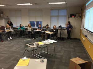
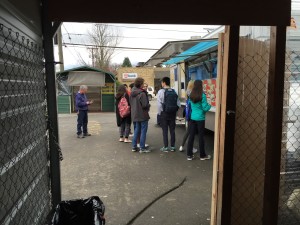
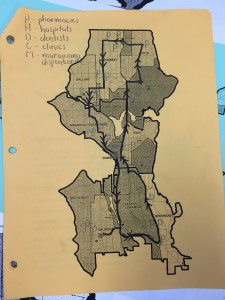
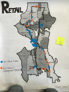
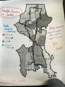
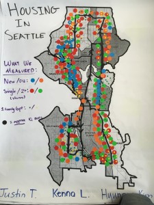
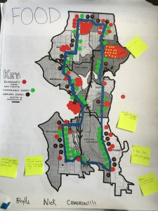
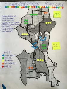
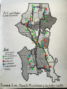
We gathered in the morning in a classroom, put on nametags, and distributed maps, agendas, and clipboards. Emma and I shared our vision of how the day would go along with the map that had a round-trip plan for a data-gathering tour of Seattle. On the trip, students would use their clipboards to make counts of items in 6 different categories: Retail, Transportation, Health Services, Housing, Food, and Art and Higher Level Services. Though we gave suggestions for what to measure, we allowed students to decide what to measure in each category. There were 3 students to a category, so they became the “experts” that day in their category.
Our essential question throughout the day was, “How does geography affect access to higher level services?” Our ultimate goal was to take a look at the data we gathered and extract themes or relationships between the Seattle neighborhoods and the 6 categories we paid attention to. To give some history before we got on the bus, Emma told students about the racially restricted covenants (http://depts.washington.edu/civilr/covenants_report.htm) in Seattle. These covenants kept homeowners from selling their property to people of different races or creeds. Separate districts in Seattle had unique covenants, which led to housing segregation. Even if they wanted to, people were bound to these restrictions. Despite fair housing acts and elimination of these restrictions now, the effects of these laws still is evident in Seattle neighborhoods.
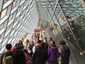
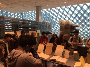
To break up the long bus ride and gain some historical context for what we might see on our tour, we stopped at the Seattle Room of the Seattle Public Library, where the curator had pulled some relevant publications on items our students might be interested in viewing: old maps, city planning documents, and plans for construction in the city. We chose to let students decide how they spent their time in the library because we felt that students had a specific assignment throughout the day.
After an hour in the library, we loaded up and headed to the South Seattle, Delridge area for lunch. We went back and forth about where to stop for lunch because we wanted students to see that there were places in the country called food deserts, where there is a scarcity of healthy food options in population-dense regions. We wanted them to see that, with a 5-dollar bill for lunch, options were limited at some places in the city and for low-income families on food stamps who received $117 per month, they realistically should have less than $2 to spend on their lunch.
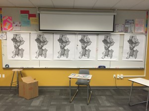
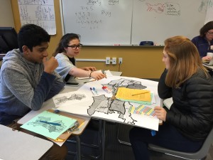
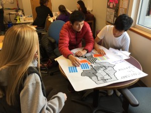
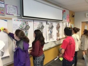
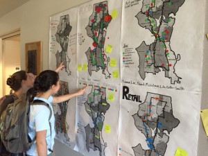
Back at school after the bus trip, students were given time to make their posters visually telling, placing different colored stickers along the route that indicated an observation within their category. After the posters were nearly finished, we had students hang them up side by side and do a gallery walk, looking at the other posters and using sticky notes to pose questions or comments on the posters. After that, each group had some time to process the sticky note comments before they gave a short presentation on the content of their poster.
We had a brief group discussion before we adjourned for the day. One student noticed that new construction places in the city seem to be collected with 1st hand retail stores, and old construction sites more associated with 2nd hand retail shops(consignment or goodwill stores). Most students saw a part of Seattle that they’d never seen before. Many students commented that they were surprised at how “similar” the part of Seattle where they live is with other places they had not seen. Students said they had preconceived notions of what South Seattle looked like, but observed something different than what they expected to see on the tour.
We wanted students to see a part of Seattle they’d never seen before. We also wanted them to have an experience that might have collided with their preconceived notions. And though it is great that they felt where they live doesn’t seem too different from other regions of the city, we wondered if that was the true takeaway we wanted for students after our trip.
Our groups did a soft analysis of the data collected, but we didn’t quantify the data we gathered, nor compare data to observe hot spots, associations between categories, or inequities in regions we traveled through. We (the teachers) wanted to dive deeper into the inequalities that lie under surface-level observations. We wanted students to see how artifacts of the city like the racially restricted covenants from the past or the current gentrification of areas of the city push some groups to the margins of Seattle and make it difficult to live comfortably for many people.
Next time, should we prioritize a specific category like housing or food, deeply looking into the data?
How can we digitize the data? I’d like to be able to overlay data from two different categories to for easier comparison.
Are there other categories that might be interesting to measure?
How can we handle larger groups of students? Another bus? Two different routes?
How can Mathematics help make the world a better place?

